Most delivery reporting breaks down for the same reasons: the “source of truth” is distributed across tools, and the relationships that matter (roadmap item → epics → issues → pull requests → release artifacts → docs) are implicit. This project turns those cross-system edges into a small local warehouse and UI so you can answer questions like:
- Which roadmap items are actually shipping this quarter?
- What’s blocked on open PRs or missing tech specs?
- Where is the evidence (links, PRs, docs) behind a status claim?
The app is intentionally lightweight: a Streamlit frontend over a DuckDB file, with ingestion scripts that pull data from your systems and normalize it into a simple graph model.
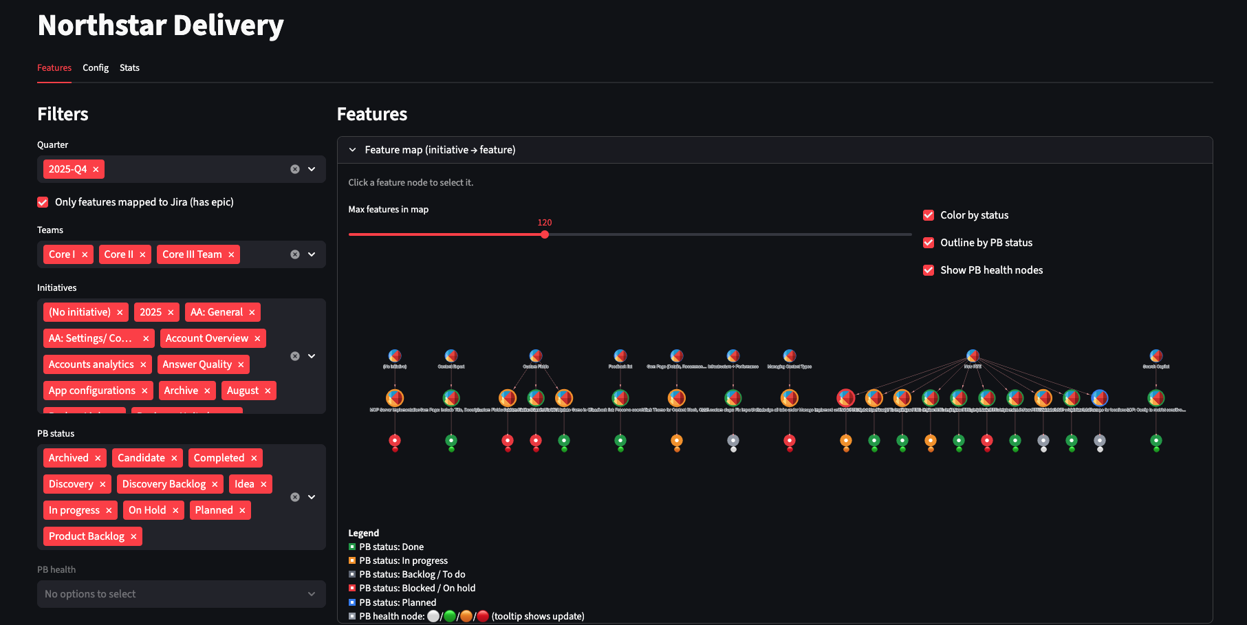 The main dashboard showing delivery status across roadmap items
Why Build This?
Traditional project management tools excel at tracking individual items but struggle with cross-system relationships. When you need to answer “What’s the actual delivery status of Initiative X?”, you end up:
- Opening 5+ tabs across Jira, GitHub, Confluence, and Linear
- Manually tracing relationships between items
- Updating a spreadsheet that’s stale by the time you finish
- Losing the links and context that justified your status assessment
This tool inverts that pattern: instead of manually hunting for relationships, it automatically ingests and stores them so you can query and visualize the complete picture.
Architecture at a Glance
The system has four main components:
- UI: Streamlit app (
app/streamlit_app.py) - Storage: A single DuckDB file (
NSD_DB_PATH, default underdata/) - Model: Two tables —
entitiesandrelations(model/schema.sql) - Ingest: Small modules under
ingest/that fetch and upsert data
Conceptually, the data model looks like this:
Roadmap item
  → epics
    → issues
      → pull requests / branches / releases
      → linked docs + "mentioned in" pages
The exact connectors depend on your environment, but the shape stays the same. This makes it easy to adapt: new tools usually mean new entity types, not schema rewrites.
The Core Design Decision: Graph-Like Schema in SQL
The most important architectural choice was storing everything in just two tables:
-- entities: every "thing" in your delivery graph
entities(
  entity_id,        -- unique identifier
  entity_type,      -- "roadmap_item", "epic", "issue", "pr", "doc", etc.
  title,
  status,
  url,              -- link back to source system
  raw_json,         -- full API response for debugging
  ...
)

-- relations: every connection between entities
relations(
  src_entity_id,    -- source entity
  rel_type,         -- "contains", "implements", "mentions", "blocks", etc.
  dst_entity_id,    -- destination entity
  evidence,         -- why we think this relationship exists
  ...
)
This approach gives you several advantages:
1. Schema Flexibility
Adding a new tool or relationship type usually means introducing a new entity_type or rel_type, not migrating across multiple tables. Want to add Slack thread tracking? Just insert entities with entity_type='slack_thread' and relate them to issues.
2. Fast Local Iteration
DuckDB is embedded and file-based. There’s no database server to configure, no connection pool to manage, no schema migrations to coordinate. You can:
# Run a query
duckdb data/delivery.db "SELECT * FROM entities WHERE status='blocked'"

# Copy the database
cp data/delivery.db data/delivery.backup.db

# Start fresh
rm data/delivery.db && python -m ingest.init_db
3. Built-In Explainability
Every relationship can carry an evidence field. When the UI shows “Epic X implements Roadmap Item Y”, you can drill down and see:
- “Epic X has parent_id=Y in Jira metadata”
- “Epic X links to Roadmap Item Y URL in description”
- “Both share the same ‘initiative’ label”
This makes debugging and trust much easier. When a PM asks “Why does this show as blocked?”, you can point to the specific PR URL and its status.
Ingestion: Incremental and Composable
Rather than a monolithic “sync everything” script, ingestion is split into small, composable modules:
Baseline Sync
Loads core roadmap items and their direct epic relationships. This is fast and gives you the basic structure.
# Example: sync just one initiative
python -m ingest.roadmap_items --initiative-id "INIT-123"
Enrichment Passes
Add progressively more detail:
- Issue children: Fetch all issues under each epic
- PR metadata: Check PR status, merge dates, review states
- Release tracking: Connect PRs to fix versions and release tags
- Documentation links: Find docs that link to or mention issues
The Streamlit UI can run these modules directly, which is handy when you want to explore a subset of work (for example, “sync just this one epic” or “sync active roadmap items for Q1”).
This design makes the tool practical for different workflows:
- Quick check: Run baseline sync, get high-level status in seconds
- Deep dive: Run all enrichment, get complete evidence chains for reporting
- Selective refresh: Re-sync just the initiative you’re reviewing
UI Design: Table, Graph, and Evidence
The UI is organized around three views that work together:
1. Filter Panel
Slice by timeframe, team ownership, and parent grouping to keep scope manageable. Because the data is local, these filters are instant.
2. Status Table
A rollup view showing delivery/spec/PR signals per roadmap item:
| Roadmap Item | Epics | Issues | Open PRs | Shipped | Warnings |
|---|---|---|---|---|---|
| User Auth v2 | 3 | 12 | 2 | 10 | Missing spec |
| Search Improvements | 2 | 8 | 0 | 8 | ✓ Complete |
The table gives you the list and lets you quickly spot problems.
3. Relationship Graph
A visual network showing how entities connect. This makes it obvious when:
- An epic has no implementing issues
- Issues are created but have no linked PRs
- A release is “done” but has no documentation
The graph gives you the shape of the work.
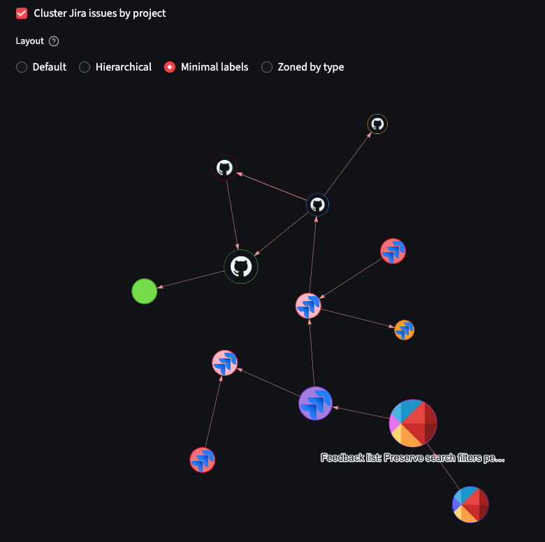 Interactive graph visualization showing connections between roadmap items, epics, issues, and PRs
4. Evidence Panel
Click any entity or relationship to see the underlying data: API responses, timestamps, derived signals, and warnings. This is where you get the receipts for delivery conversations.
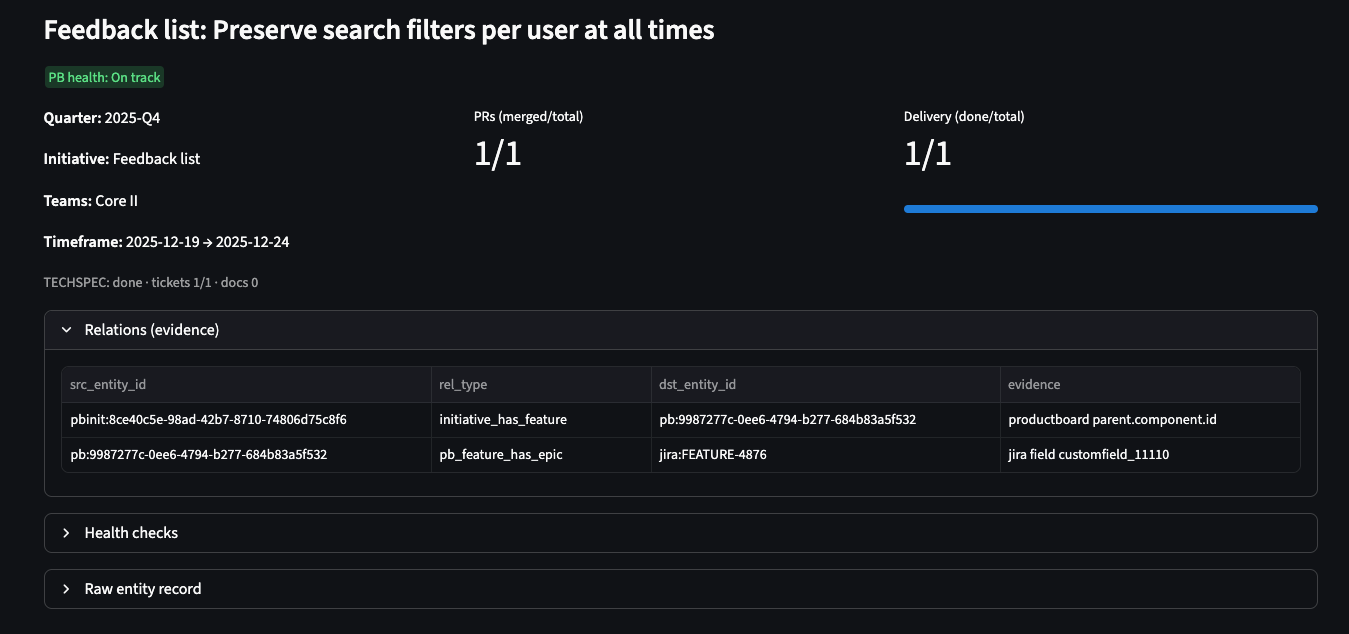 Detailed evidence panel showing the underlying data and relationships for a selected entity
Configuration: Portable by Default
The tool is configured via environment variables with an optional local config file:
# .env.example
JIRA_BASE_URL=https://your-org.atlassian.net
JIRA_API_TOKEN=your_token_here
GITHUB_TOKEN=ghp_your_token
LINEAR_API_KEY=lin_api_your_key
NSD_DB_PATH=data/delivery.db
For local development, you can also use .streamlit/local_config.json (gitignored).
The goal is to keep the repo environment-agnostic: no hardcoded org names, no baked-in URLs, and no secret material in code. This makes it easy to share the tool across teams or open-source it.
Deployment Model
Because the backend is just a Python process and the “database” is a single file, deployment is straightforward:
Option 1: Stateless Container
Write the DuckDB file to container /tmp and accept data loss on redeploy. Good for dev/staging environments where you’re constantly iterating.
Option 2: Stateful Container
Mount a volume (EFS, Persistent Volume, etc.) and persist the DuckDB file across restarts. This is what you want for production.
A basic health endpoint is available at Streamlit’s /_stcore/health path, which works with most load balancers.
Example Kubernetes deployment:
apiVersion: apps/v1
kind: Deployment
metadata:
  name: delivery-tracker
spec:
  replicas: 1
  template:
    spec:
      containers:
      - name: streamlit
        image: your-registry/delivery-tracker:latest
        ports:
        - containerPort: 8501
        env:
        - name: NSD_DB_PATH
          value: /data/delivery.db
        volumeMounts:
        - name: data
          mountPath: /data
      volumes:
      - name: data
        persistentVolumeClaim:
          claimName: delivery-tracker-pvc
Extending the System
Most extensions follow the same pattern:
- Add a new ingest module that fetches data from a system (or reads a local export)
- Normalize records into
entitiesand add edges inrelations, includingevidencewhere helpful - Update UI rollups/health checks if the new data should affect delivery signals
- Add icons and graph rendering behavior for the new
entity_typeif you want it visualized
This keeps complexity localized: ingestion code changes don’t require redesigning the warehouse, and UI changes don’t require rewriting ingestion.
Example: Adding Slack Support
Want to track Slack threads that mention issues?
# ingest/slack_threads.py
def sync_slack_threads(channel_id, since_date):
    threads = slack_client.conversations_history(
        channel=channel_id,
        oldest=since_date
    )

    for thread in threads['messages']:
        # Create entity for thread
        upsert_entity(
            entity_id=thread['ts'],
            entity_type='slack_thread',
            title=thread['text'][:100],
            url=f"https://slack.com/archives/{channel_id}/p{thread['ts']}",
            raw_json=thread
        )

        # Extract issue mentions and create relations
        for issue_key in extract_issue_keys(thread['text']):
            upsert_relation(
                src_entity_id=issue_key,
                rel_type='discussed_in',
                dst_entity_id=thread['ts'],
                evidence=f"Mentioned in thread: {thread['text'][:50]}"
            )
Then update the graph renderer to show Slack icons, and you’re done.
Real-World Impact
After using this system for a quarter, a few patterns emerged:
1. Faster Status Updates
What used to take 2 hours of manual tab-switching now takes 10 minutes: sync data, review table, export screenshot for slides.
2. Earlier Problem Detection
The graph view makes it obvious when work is “started” but has no code activity, or when PRs are merged but not released. These usually indicate process breakdowns worth investigating.
3. Better Delivery Conversations
Instead of “I think we’re on track”, you can say “Here’s the evidence: 8/10 issues are merged, 2 are in PR review, and the release is cut for next Tuesday.”
The evidence trail also helps when stakeholders ask “Why is this taking so long?” You can show the PR review backlog or the 5 dependencies that landed late.
Getting Started
From the repo root:
# Setup
python3 -m venv .venv
source .venv/bin/activate
pip install -r requirements.txt

# Initialize database
python3 -m ingest.init_db

# Configure credentials (see .env.example)
export JIRA_API_TOKEN=your_token_here
export GITHUB_TOKEN=ghp_your_token

# Run the UI
streamlit run app/streamlit_app.py
Then configure credentials and base URLs via environment variables and run the ingest modules you need.
Lessons Learned
What Worked Well
DuckDB as a local warehouse: The file-based approach meant zero infrastructure overhead. No Docker Compose, no PostgreSQL setup, no cloud database costs. Just a 50MB file that you can scp around.
Graph model in SQL: While graph databases are purpose-built for this, the two-table approach was surprisingly flexible. SQL joins handle most queries well, and you can always export to NetworkX for complex graph algorithms.
Streamlit for prototyping: Going from idea to working UI in a weekend was only possible because Streamlit handles all the web framework boilerplate. The tradeoff is less control over styling, but for internal tools, that’s fine.
What I’d Change
Better caching strategy: DuckDB is fast, but re-rendering large graphs on every filter change gets slow. I’d add more aggressive memoization and maybe switch to a client-side graph library.
More structured evidence: The free-text evidence field works, but structured metadata (like evidence_type and confidence_score) would enable better filtering and validation.
Incremental sync: Right now, most ingest modules do full table scans. Adding “sync only what changed since last run” would make updates much faster.
Conclusion
This project reinforced a lesson I keep learning: for internal tools, simple architectures win. A two-table schema, an embedded database, and a batteries-included UI framework got me 90% of the way there. The remaining 10% is tooling-specific connectors, which are unavoidable anyway.
If you’re drowning in cross-system delivery tracking, consider building something similar. The core components (Streamlit + DuckDB + graph model) are portable, and you can adapt the ingestion layer to whatever tools your team uses.
Next Steps:
- Try adding support for your tool stack (Linear, Azure DevOps, etc.)
- Experiment with different graph layouts and visualizations
- Add alerting for common delivery problems (stale PRs, missing docs, etc.)
Have you built similar delivery tracking systems? What patterns worked well for your team? You can find me on:
- GitHub: github.com/hmelenok and github.com/shelfio (open source projects)
- Threads: @hmelenok
- X (Twitter): @hmelenok