Engineering leaders want DORA metrics, but teams rarely want another bespoke “metrics service” to build and maintain. I solved this by using n8n as the orchestration layer, Google Sheets as a lightweight warehouse, and Looker Studio for visualization—fed by data pulled from GitHub releases, Datadog incidents, and a service catalog.
This article walks through the architecture, the data model, and the trickiest implementation detail: Lead Time for Changes calculated from GitHub releases and the earliest non-merge commit in the corresponding PR.
What We’re Building
A pipeline that:
- Schedules periodic runs in n8n
- Extracts deployment events from GitHub releases (as a pragmatic proxy for “deployments”)
- Enriches each release with:
- Owning team/service mapping
- Publisher (author) → team mapping
- Lead time from “first meaningful PR commit” → “release published”
- Extracts incident data from Datadog for restoration-time and reliability slices
- Persists everything into a structured Google Sheet with idempotent upserts
- Visualizes in Looker Studio using the Google Sheet as a connector
The end result is a durable, maintainable DORA metrics pipeline that doesn’t require building or hosting a custom service.
High-level architecture showing data flow from sources through n8n to Google Sheets and Looker Studio
Architecture Overview
Data Sources
- GitHub GraphQL: Releases (proxy for deployments) + PR commit history (lead-time attribution)
- Service Catalog (OpsLevel): Repo/service/team ownership mapping
- Datadog Incidents API: Incident metadata and timing fields (useful for time-to-restore slices)
- Google Calendar (optional): “Who’s Out” absences, useful for explaining anomalies
Storage
Google Sheets with multiple tabs to separate configuration and fact tables. This acts as a mini data warehouse with clear table separation.
Orchestration
n8n running scheduled workflows plus a manual backfill trigger. The workflow-based approach makes the entire pipeline visible and debuggable in a visual editor.
The Google Sheets Data Model
The sheet acts like a mini data warehouse with separate “tables” (tabs). This separation makes BI and spreadsheet formulas much cleaner than mixing everything into one sheet.
Tab structure:
config          → Runtime parameters (e.g., current year)
opslevel_map    → Service/repo ownership mapping (service ↔ repo ↔ team, tier, type)
people          → Maps person name to team (for attribution like "published_by_team")
releases        → Deployment/release fact table (one row per release/tag)
incidents       → Incident fact table (one row per Datadog incident)
absences        → Optional context table
Each tab serves a specific purpose:
- config: Single source of truth for runtime parameters
- opslevel_map: The join key that connects GitHub repos to teams
- people: Enables attribution (“who deployed this?“)
- releases: The core DORA deployment frequency and lead time facts
- incidents: The reliability and restoration time facts
- absences: Contextual data for explaining anomalies
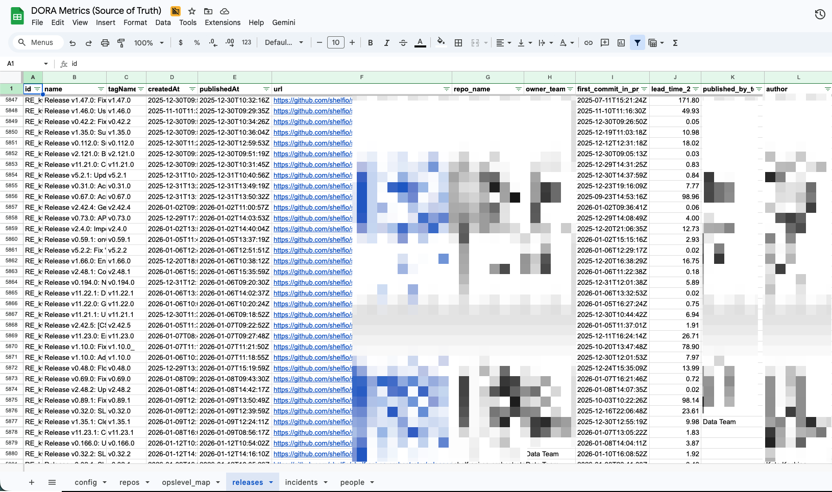 Google Sheets showing multiple tabs (config, opslevel_map, releases, incidents) with sample data structure
Orchestration in n8n
A practical pattern is splitting work into periodic refresh and enrichment/backfill workflows.
Periodic Refresh (Weekly)
The main workflow runs every 7 days at 07:00 and:
- Loads config
- Refreshes ownership maps from OpsLevel
- Pulls new releases from GitHub
- Appends/upserts into the fact tables
This keeps the data current without requiring constant polling.
Enrichment / Incremental Runs
Additional scheduled paths and a manual trigger handle ad-hoc runs and backfills. This separation is important because “fetch releases” and “enrich releases with PR commit history” have different performance characteristics and failure modes.
The manual trigger is particularly valuable for:
- Historical data loads
- Re-enriching existing releases after fixing bugs
- Testing changes without waiting for the schedule
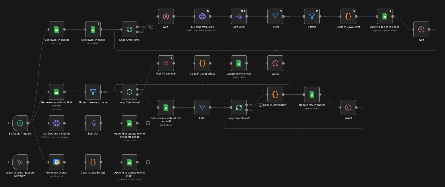 n8n workflow showing scheduled trigger, GitHub API calls, data transformation nodes, and Google Sheets upsert operations
Implementation Details That Matter
1. Ownership Mapping: Team/Service ↔ Repo
To slice metrics by team, you need a deterministic mapping from “deployment event” to “owning team.”
The workflow uses OpsLevel GraphQL to retrieve “descendant services” for multiple teams, then writes a mapping into the opslevel_map tab. The workflow filters out unwanted service types (e.g., excluding NPM packages) before upserting.
Why this matters: GitHub alone usually can’t reliably tell you ownership in a modern org. The service catalog becomes the authoritative join key.
Example mapping row:
service_name | repo_url                           | team      | tier      | type
delivery-api | github.com/org/delivery-api        | Platform  | tier_1    | backend_service
web-app      | github.com/org/web-app             | Frontend  | tier_1    | web_application
Without this mapping, you can’t answer questions like “How is the Platform team doing on deployment frequency?” or “Which tier_1 services have the longest lead times?”
2. Deployment Frequency Proxy: GitHub Releases
DORA’s “Deployment Frequency” is ideally tied to production deployments. In practice, if you have a consistent release/tagging process, GitHub Releases can be a reliable proxy.
The workflow:
- Queries GitHub GraphQL for
releases(orderBy:{field:CREATED_AT, direction:DESC}) - Filters out drafts and “untagged” releases
- Writes releases into the
releasestab using an idempotent “appendOrUpdate” keyed byid
Key design choice: Use the release id as the primary key, and implement all Sheets writes as upserts. That makes reruns safe and eliminates duplicate data issues.
Example GraphQL query:
query GetReleases($owner: String!, $repo: String!, $cursor: String) {
  repository(owner: $owner, name: $repo) {
    releases(first: 100, after: $cursor, orderBy: {field: CREATED_AT, direction: DESC}) {
      nodes {
        id
        name
        tagName
        publishedAt
        isPrerelease
        isDraft
        author {
          login
        }
      }
      pageInfo {
        hasNextPage
        endCursor
      }
    }
  }
  rateLimit {
    remaining
    resetAt
  }
}
3. Lead Time for Changes: Release Published - First Meaningful PR Commit
This is the most technically interesting part of the implementation.
Goal: For each release, estimate lead time from “code started that eventually shipped” to “production shipped.”
The workflow does this in two steps:
Step 1: Find the Relevant PR and Valid First Commit
Given a tag (refs/tags/<tagName>), query GitHub GraphQL to fetch:
- The tag commit SHA
- Associated PRs
- Commits in the chosen PR
Select the PR whose mergeCommit.oid matches the tag SHA if possible.
From the PR commits, pick the earliest commit that is not a merge commit:
- Parent count < 2
- Message does not start with “Merge ”
// n8n Code node example
const commits = $input.item.json.commits.nodes;

// Filter out merge commits
const nonMergeCommits = commits.filter(commit => {
  const isMerge = commit.parents.totalCount >= 2 ||
                  commit.message.startsWith('Merge ');
  return !isMerge;
});

// Sort by committed date
nonMergeCommits.sort((a, b) =>
  new Date(a.committedDate) - new Date(b.committedDate)
);

const firstCommit = nonMergeCommits[0];
Step 2: Compute Lead Time in Days
Convert timestamps to Date objects and calculate the difference:
const publishedAt = new Date($input.item.json.publishedAt);
const firstCommitAt = new Date(firstCommit.committedDate);

const leadTimeDays = (publishedAt - firstCommitAt) / (1000 * 60 * 60 * 24);

return {
  json: {
    release_id: $input.item.json.id,
    lead_time_days: Math.round(leadTimeDays * 100) / 100,
    first_commit_sha: firstCommit.oid,
    first_commit_at: firstCommit.committedDate
  }
};
Persist this in a lead_time_2p column in the releases sheet.
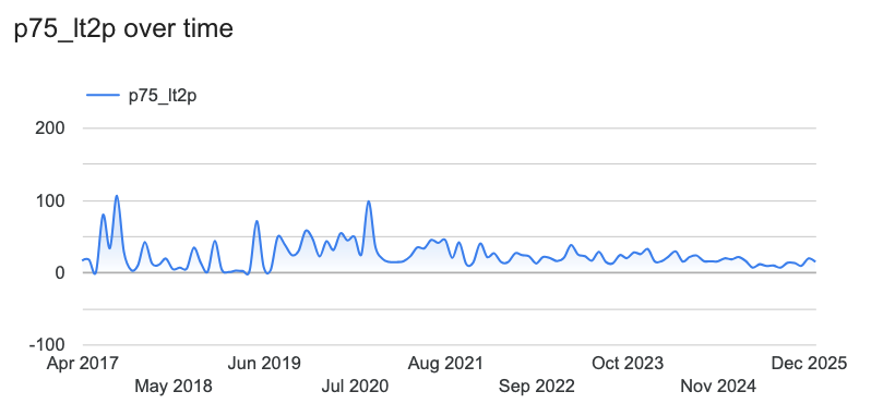 Visual timeline showing how lead time is calculated from first non-merge commit to release publication
This results in a lead-time signal that is:
- Explainable: You can trace it back to specific commits
- Reproducible: Rerunning the workflow produces the same results
- Trustworthy: Computed from sources you already trust (GitHub metadata)
Known Limitations
Be transparent about these constraints:
- PR commit pagination: If PRs have >100 commits, you need pagination to be fully correct
- “First commit” is a proxy: It’s not the same as “first commit that contributed to the release” unless your release tagging aligns with merge commits consistently
- Monorepos and backports may skew signals: A backport cherry-pick might show an artificially short lead time
- Multiple PRs per release: If your release contains multiple PRs, this approach only considers one PR
Despite these limitations, the signal is still valuable for understanding trends and comparing teams.
Incidents: Datadog as the Reliability Fact Table
To approximate restoration-time analysis (and later change-failure rate), pull incidents from Datadog and upsert them into an incidents tab keyed by public_id.
The workflow writes a rich set of fields including:
- Timestamps:
created,detected,resolved - Computed durations:
time_to_detect,time_to_repair,time_to_resolve - Classification fields:
severity,state,root_cause,services,teams
Example Datadog API call:
// n8n HTTP Request node
{
  "method": "GET",
  "url": "https://api.datadoghq.com/api/v2/incidents",
  "authentication": "predefinedCredentialType",
  "nodeCredentialType": "datadogApi",
  "qs": {
    "page[size]": 100,
    "filter[created][gte]": "{{$node['Config'].json['start_date']}}",
    "include": "attachments"
  }
}
Why a separate incidents table is valuable:
- You can compute MTTR variants based on different time definitions (
time_to_restorevstime_to_resolve) - You can slice by team/service, severity, region, etc.
- Later, you can compute Change Failure Rate by joining incidents to deployments (time-window correlation or explicit service mapping)
Example incident row:
public_id | severity | created              | resolved             | time_to_resolve | services      | teams
INC-1234  | SEV-1    | 2025-12-15 14:23:00  | 2025-12-15 16:45:00  | 2.37           | delivery-api  | Platform
INC-1235  | SEV-2    | 2025-12-16 09:12:00  | 2025-12-16 10:30:00  | 1.30           | web-app       | Frontend
Visualization in Looker Studio
Once Sheets is stable as a fact store, visualization is straightforward. Connect Looker Studio (or your BI tool of choice) to the Google Sheet and create dashboards.
Recommended Charts
Deployment Frequency:
- Releases per week/month per team/service
- Trend line showing improvement over time
- Breakdown by service tier
Lead Time for Changes:
- Rolling average of
lead_time_2p(e.g., 4-week moving average) - Distribution (p50/p75/p90) if your BI tool supports it
- Comparison across teams
Incidents:
- Incident count per week
- MTTR over time (by severity, by service, by team)
- Incidents by root cause
Key modeling tip: Keep raw tables in Sheets and do most transformations in your BI tool (or in separate “derived” tabs) to avoid complex formulas that are hard to version-control.
Example Looker Studio setup:
- Add Google Sheets as a data source
- Create a blended data source joining
releasesandopslevel_mapon repo URL - Build scorecards showing current metrics vs. targets
- Add time series charts with week-over-week comparisons
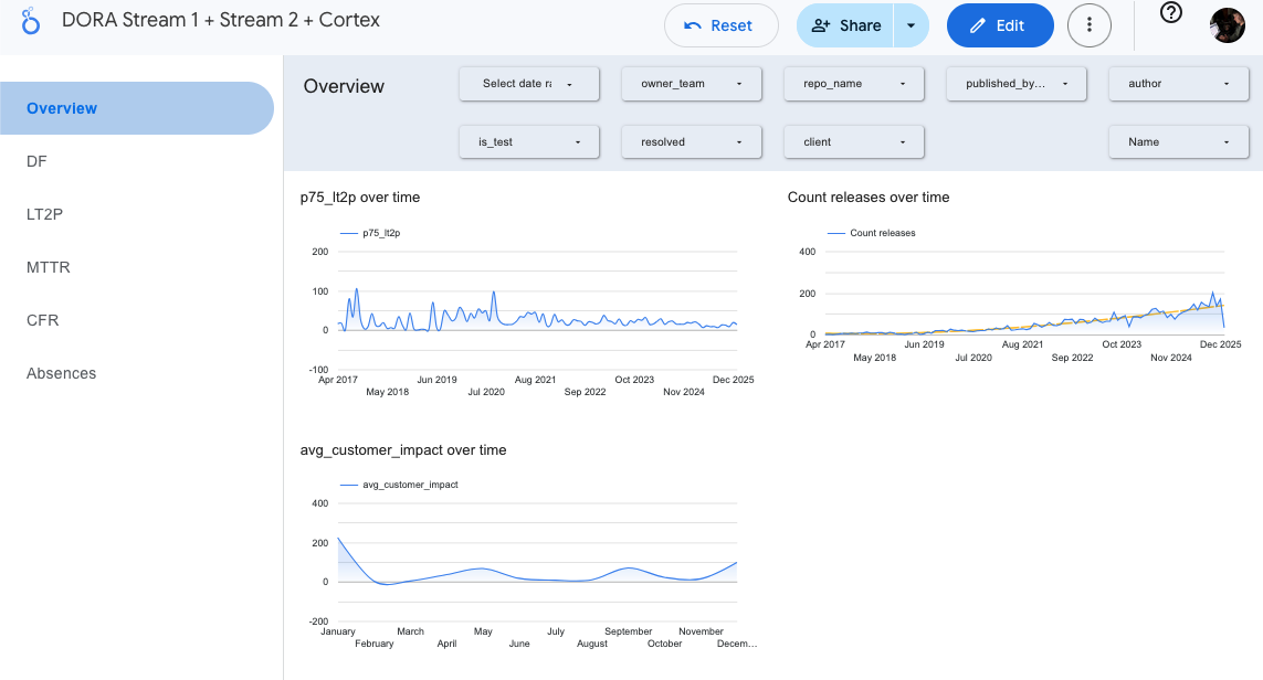 Looker Studio dashboard showing deployment frequency, lead time trends, MTTR, and incident metrics across teams
Operational Hardening Checklist
These items make the difference between a demo and a durable system.
1. Credentials Management
- Store API keys in n8n Credentials / environment variables
- Do not hardcode tokens in workflow nodes
- Rotate keys if you ever exported a workflow that contained them
- Use n8n’s built-in credential types when available (GitHub, Datadog, Google Sheets all have native support)
2. Idempotent Writes
Always upsert with a stable key:
releases:idincidents:public_id
This makes reruns safe and simplifies recovery. Use Google Sheets’ “Lookup Column” feature to match on the key field, then update if found or append if not found.
3. Rate Limiting + Retries
GitHub GraphQL has rate limits (query rateLimit { remaining resetAt } in every call).
Best practices:
- Use wait/retry nodes for transient failures
- Batch loops (
split-in-batches) to control throughput - Check rate limit remaining and pause if getting low
- Log rate limit info for debugging
Example rate limit handling:
// n8n Code node
const rateLimit = $input.item.json.rateLimit;

if (rateLimit.remaining < 100) {
  const resetAt = new Date(rateLimit.resetAt);
  const waitSeconds = (resetAt - new Date()) / 1000;

  return {
    json: {
      shouldWait: true,
      waitSeconds: Math.ceil(waitSeconds)
    }
  };
}

return { json: { shouldWait: false } };
4. Backfill Strategy
- Manual trigger for historical loads
- Separate workflow for enrichment (PR commit parsing) so you can re-run without re-pulling everything
- Date range parameters to control scope
- Progress logging so you know where to resume if interrupted
5. Data Quality Guardrails
- Filter untagged/draft releases
- Null-safe handling when a PR cannot be found for a tag
- Audit outliers in lead time (negative or extremely large values)
- Add validation nodes that fail fast on data quality issues
Example validation:
// n8n Code node
const leadTime = $input.item.json.lead_time_days;

if (leadTime < 0 || leadTime > 365) {
  throw new Error(`Invalid lead time: ${leadTime} days for release ${$input.item.json.id}`);
}

return $input.item;
Lessons Learned
What Worked Well
n8n as orchestration: The visual workflow editor made debugging and iteration much faster than writing code. Being able to inspect data at each node and rerun failed steps was invaluable.
Sheets as a warehouse: For this scale (hundreds of releases per month), Google Sheets performs surprisingly well. The built-in sharing and familiar interface made collaboration easy.
Service catalog as join key: Having OpsLevel as the authoritative source for ownership eliminated endless debates about “which team owns this repo.”
Idempotent upserts: Being able to rerun workflows without fear of duplicates saved hours of cleanup work.
What I’d Change
Better pagination handling: The current implementation assumes PRs have <100 commits. For repos with large PRs, this needs proper pagination.
Change Failure Rate: The current pipeline doesn’t correlate incidents to deployments. Adding a time-window join (e.g., “incidents within 24 hours of a release for the same service”) would complete the DORA four.
More granular deployment signals: GitHub releases are a good proxy, but direct integration with deployment tools (Argo CD, Spinnaker, etc.) would be more accurate.
Alert on data freshness: Adding a monitor that alerts if the workflow hasn’t run successfully in 7+ days would catch silent failures.
Getting Started
If you want to build something similar:
Prerequisites
- n8n instance (self-hosted or n8n Cloud)
- GitHub personal access token with
reposcope - Datadog API key
- Google Sheets API access
- Service catalog (OpsLevel, Backstage, or similar)
Implementation Steps
- Set up the Google Sheet structure with the tabs described above
- Create n8n credentials for GitHub, Datadog, Google Sheets
- Build the ownership mapping workflow first—this is your foundation
- Add the releases extraction workflow with basic fields
- Layer in lead time enrichment once the basics work
- Add incident extraction for the reliability metrics
- Connect Looker Studio and build your first dashboard
- Iterate on data quality and add operational hardening
Start simple and add complexity incrementally. Getting deployment frequency working is more valuable than a perfect lead time calculation.
Conclusion
This project reinforced a lesson about pragmatic data engineering: you don’t need a sophisticated data platform to get meaningful metrics. A workflow tool, a spreadsheet, and well-chosen APIs can go a long way.
The key insights:
- Use what you have: GitHub releases, incident tickets, and service catalogs already contain DORA metrics—you just need to extract and correlate them
- Make it idempotent: Safe reruns eliminate entire classes of operational problems
- Separate concerns: Ownership mapping, data extraction, enrichment, and visualization should be loosely coupled
- Start with deployment frequency: It’s the easiest DORA metric to implement and proves the pattern works
If your organization is asking for DORA metrics, consider this approach before building a custom service. The workflow is maintainable, the data is inspectable, and the entire system can be understood by looking at the n8n canvas.
Next Steps:
- Add Change Failure Rate by correlating incidents to deployments
- Implement proper PR commit pagination for large PRs
- Add alerting for data freshness and outliers
- Explore direct deployment tool integration (Argo CD, Spinnaker)
Have you built similar metrics pipelines? What tools and patterns worked for your team? You can find me on:
- GitHub: github.com/hmelenok and github.com/shelfio (open source projects)
- Threads: @hmelenok
- X (Twitter): @hmelenok